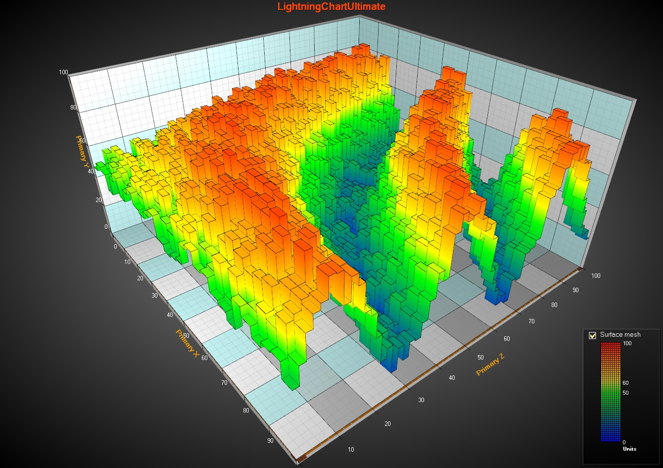
Why Plotting Matters
If your data looks good, people trust it more. Graphs and Charts are easier for anybody to understand than a .csv file or database entries as they require much less technical knowledge to understand.
Examples of financial plots (MPL)
Time Series Plot
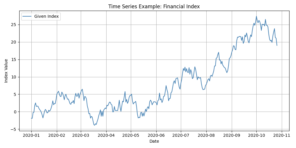
Description:
A time series plot visualises data points indexed in time order. It’s commonly used to observe trends, seasonal patterns, or anomalies over a continuous period.
Purpose:
To analyse how a variable changes over time.
Use Cases:
-
Financial markets (e.g., stock prices, index performance)
-
Economic indicators (e.g., inflation, unemployment)
-
Scientific measurements over time (e.g., temperature, growth rates)
Insight Provided:
Highlights trends, cycles, and potential outliers or regime shifts in the data.
Histogram
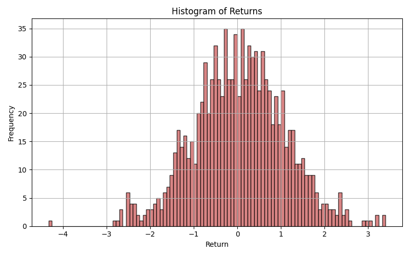
Description:
A histogram shows the distribution of a single continuous variable by dividing it into intervals (bins) and counting how many data points fall into each.
Purpose:
To understand the shape, central tendency, and spread of a distribution.
Use Cases:
-
Analysing returns or error distributions
-
Assessing normality in statistical testing
-
Identifying skewness or outliers
Insight Provided:
Reveals whether data is normally distributed, skewed, or has heavy tails—crucial for selecting proper statistical models.
Box Plot (Box-and-Whisker Plot)
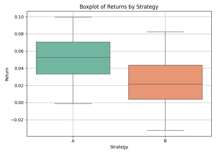
Description:
Box plots display the distribution of a variable through its quartiles and highlight potential outliers.
Purpose:
To compare distributions across categories or groups, especially in terms of spread and central location.
Use Cases:
-
Comparing performance of algorithms or strategies
-
Visualising risk/return trade-offs
-
Identifying outliers in clinical or financial data
Insight Provided:
Summarises five-number statistics: minimum, Q1, median, Q3, and maximum. Helps detect asymmetry and variability between groups.
Scatter Plot with Regression Line
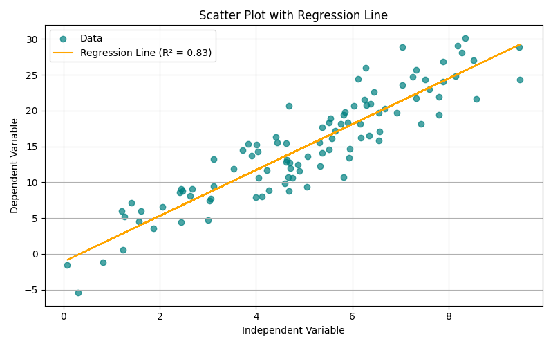
Description:
A scatter plot visualises the relationship between two continuous variables. Adding a regression line indicates the direction and strength of linear association.
Purpose:
To assess correlation, causality assumptions, and model fitness.
Use Cases:
-
Regression analysis in econometrics or machine learning
-
Portfolio risk vs. return assessment
-
Marketing: advertising spend vs. revenue
Insight Provided:
Visual representation of correlation (positive, negative, or none), and strength of linear trend. Regression line gives predictive value.